Jobless claims down: A new declining trend?
Loading...
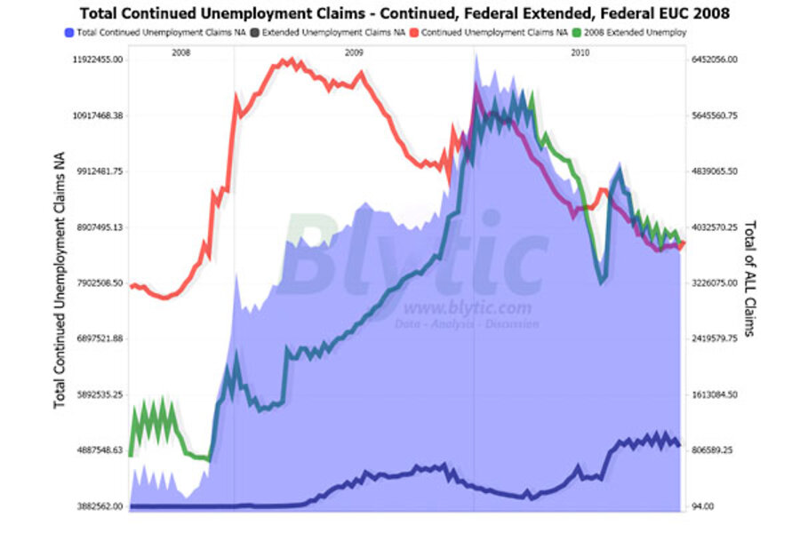
Today’s jobless claims report showed a notable decline to both initial and continued unemployment claims as a declining trend shaped up for initial claims and traditional continued claims continued to trend down.
Seasonally adjusted “initial” unemployment declined by 34,000 to 407,000 claims from last week’s revised 441,000 claims while “continued” claims declined by 142,000 resulting in an “insured” unemployment rate of 3.3%.
Since the middle of 2008 though, two federal government sponsored “extended” unemployment benefit programs (the “extended benefits” and “EUC 2008” from recent legislation) have been picking up claimants that have fallen off of the traditional unemployment benefits rolls.
Currently there are some 4.66 million people receiving federal “extended” unemployment benefits.
Taken together with the latest 3.73 million people that are currently counted as receiving traditional continued unemployment benefits, there are 8.40 million people on state and federal unemployment rolls.
The following chart shows the recent trend in initial non-seasonally adjusted initial jobless claims with the year-over-year percent change acting as a rough equivalent of a seasonally adjustment.
Historically, unemployment claims both “initial” and “continued” (ongoing claims) are a good leading indicator of the unemployment rate and inevitably the overall state of the economy.
The following chart shows “population adjusted” continued claims (ratio of unemployment claims to the non-institutional population) and the unemployment rate since 1967.
Adjusting for the general increase in population tames the continued claims spike down a bit.
The following chart (click for larger version) shows “initial” and “continued” claims, averaged monthly, overlaid with U.S. recessions since 1967.
Also, acceleration and deceleration of unemployment claims has generally preceded comparable movements to the unemployment rate by 3 – 8 months (click for larger version).
Add/view comments on this post.
------------------------------
The Christian Science Monitor has assembled a diverse group of the best economy-related bloggers out there. Our guest bloggers are not employed or directed by the Monitor and the views expressed are the bloggers' own, as is responsibility for the content of their blogs. To contact us about a blogger, click here. To add or view a comment on a guest blog, please go to the blogger's own site by clicking on the link above.


