Twitter's redesign: More photos for profile pages, and a new iPad app
Loading...
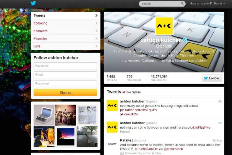
Twitter CEO Dick Costolo unveiled the social media company's new design on Tuesday, and there's no point in beating around the bush here: Twitter looks a lot more like Facebook now.
The biggest design change is that pages now have a big header image at the top -- similar to Facebook's Timeline banner -- with a user's avatar superimposed over it. (Note that the new header won't replace the background image that lots of users employ; you can still paste a giant photo of a cat behind your tweets if you like.) The single-row photo stream is gone, too; it's been given prominence higher on the page and an extra row of real estate.
The facelift extends past Twitter's homepage to mobile apps for iPhone, Android, and iPad, the latter of which the company has apparently rebuilt from scratch. All of the new mobile apps include photo streams -- a feature that used to be limited to the site itself -- allowing users to flick through photos and enlarge them to fill the screen. The iPad app also lets you expand certain tweets for more context, like tapping an article link to read a summary or tapping a video to play it in fullscreen.
For now, the changes won't take effect automatically: Twitter users can switch over to the new look by uploading a header photo. Twitter will eventually bump everyone over to the new design, just like Facebook did with Timeline a few months back. No word yet on when the company will flip the switch for all its users, but the Today Show (where Costolo unveiled the redesign for the first time on Tuesday morning) speculates that it could happen in the next few months.
The design does have some downsides for third-party developers: mobile non-native Twitter apps have lost the ability to post a picture to Twitter, although they should be functioning normally aside from that. This probably doesn't come as much of a shock to developers, since Twitter has been exerting more control over its platform over the past few months.
The redesign definitely puts visuals front and center, which has been a big trend with social media companies this year (think not only of Facebook, but of the meteoric rise of Pinterest, a site comprised almost entirely of images). It's a bold move for Twitter, though, which still has short text updates at its heart. The redesign, with its emphasis on big photos, may encourage people to think of their Twitter page as a landing site, rather than just an ephemeral collection of updates accessed through a third-party client. And, of course, the longer visitors linger on each page, the better Twitter will be able to monetize the site with ads.
What do you think of Twitter's new look? Is it a useful improvement, UI boondoggle, or somewhere in between? Let us know in the comments section below. And for more on how technology intersects daily life, follow us on Twitter @venturenaut.


