Why Instagram parted ways with its retro icon
Loading...
Instagram users found a colorful surprise on Wednesday, when the photo and video sharing service rolled out a massive aesthetic revamp aimed at giving a fresh look to its familiar retro icon.
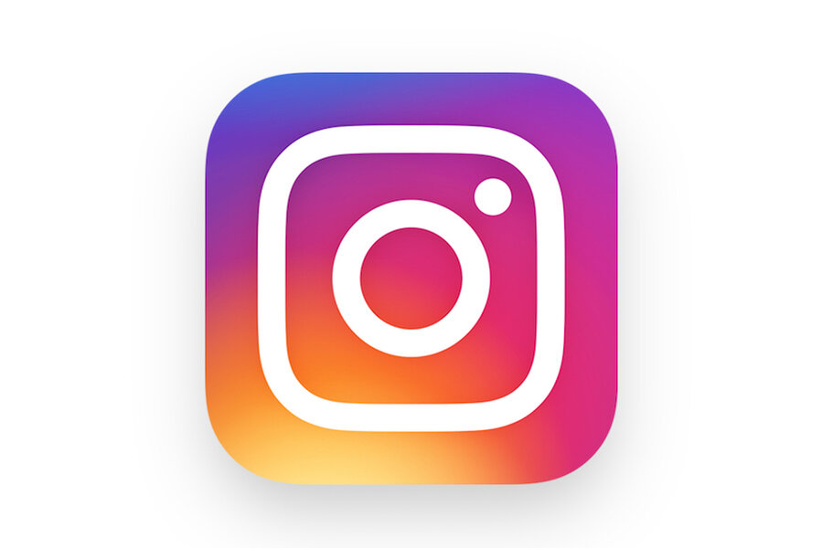
The realistic-looking camera icon was replaced with a more colorful, more abstract rainbow logo. Inside the app, users found a new, sleekly minimalist color palette.
As more smartphone users see themselves as sophisticated storytellers and content creators, turning everyday moments into carefully crafted vignettes to share with their "followers," designers at Instagram felt it was time to step up the company's image as well.
"The Instagram community has evolved over the past five years from a place to share filtered photos to so much more – a global community of interests sharing more than 80 million photos and videos every day," Instagram said in a press release about the update. "Our updated look reflects how vibrant and diverse your storytelling has become."
A lot has changed for Instagram over the past five years. The app launched on Oct. 6, 2010, gained its first million users that December, hit 10 million users Sept. 2011, was bought by Facebook in 2012, and reached 400 million active users in Sept. 2015.
And on top of rapid growth and new owners, Instagram rolled out a new family of apps including Layout, Boomerang, and Hyperlapse.
Just about the only thing that hadn't changed already was the original skeuomorphic icon – until now.
It was time for something new, according to Ian Spalter, Instagram's head of design.
"Brands, logos and products develop deep connections and associations with people, so you don't just want to change them for the sake of novelty," Mr. Spalter writes in a blog post on Medium. "But the Instagram icon and design was beginning to feel, well…not reflective of the community, and we thought we could make it better."
The brainstorming process for what would become the new Instagram logo began last year with a design team committed to bringing out a new logo more representative of Instagram's present and future, but still respectful of the company's history.
The team decided to flatten out the app to make it fit better with the flattened iOS look on Apple devices, but keep three key aspects: the rainbow, lens, and viewfinder. Those were the aspects the team found that people who were asked to draw the classic Instagram icon from memory in 5 seconds all identified, according to Spalter.
In the new app, the rainbow was turned into the gradient background, while the camera, lens, and viewfinder were softened into outlines overlaying the gradient. The result: an expression of the colorful stories posted to Instagram. The icons of the other apps in the Instagram family were updated as well for continuity and to better reflect their purposes.
Inside, the Instagram app went the opposite direction: simplified in favor of whites and black that allow users' videos and images to provide the color, according to the press release.
The white background may also have been another update to simplify the app for enhanced video viewing. In March and April of 2016, Instagram made a large shift to promote video on the app, expanding video times from 15 seconds to 60 seconds and bringing back the ability to add several clips to the same video.
Possibly to entice advertisers, the app also added a public view count to show Instagram videos going viral. Advertising experts at eMarketer predicts Instagram could reach $2.81 billion in mobile ad revenue in 2017.
But what do the users say about the new update? Users on Twitter appeared conflicted:


