Huge new map showing the evolution of the Milky Way

The Milky Way galaxy is expanding outward, with older stars near its center, and younger ones found towards the outskirts, tens of thousands of lights years away.

|
G. Stinson/Max Planck Institute for Astronomy
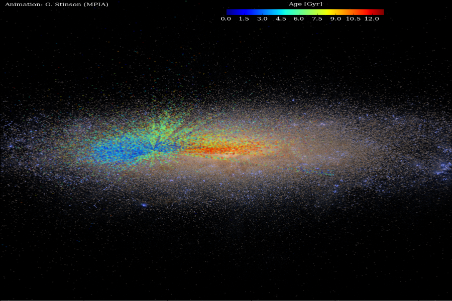
This image shows the latest results as colored dots superimposed on an artist’s conception of the Milky Way. Red dots show stars that formed when the Milky Way was young and small, while blue shows stars that formed more recently, when the Milky Way was big and mature. The color scale shows how many billion years have passed since those stars formed.

Scientists from the Max Planck Institute for Astronomy in Heidelberg, Germany have created the largest map showing the ages of stars in our galaxy.

A representative cross-section of the Milky Way map confirms what astronomers have long predicted: that for billions of years our galaxy has been expanding outward, with the oldest stars concentrated towards the center of the swirling disk of gas and dust, and younger ones spread out towards its outskirts, about 50,000 light-years away.

“In the galaxy we know best – our own – we can clearly read the story of how galaxies form in a universe with large amounts of cold dark matter,” said Melissa Ness, a postdoctoral researcher at Max Planck, in an announcement. “Because we can see so many individual stars in the Milky Way, we can chart its growth in unprecedented detail,” she added.

Ness and her team studied the light emitted from about 70,000 red giant stars to produce the large map showing the evolution of the Milky Way. Red giant stars are luminous dying stars, huge in size but low in mass.

"These are an extremely valuable star to get ages for, because they are very bright and we see them at very large distances," Dr. Ness told the BBC.

To create the map, the astronomers used information collected by the Sloan Digital Sky Survey, a project to create three-dimensional maps of the universe, to study the light wavelengths emitted by thousands of red giants, 300 at a time. These spectra helped the astronomers determine the chemical composition of the stars, information that hinted at their age, but alone could not determine it.

To figure out ages, reported the BBC, the team had to combine the wavelength learnings with observations of the same stars made by NASA’s Kepler satellite, which has discovered more than 1,000 stars since it was launched into space in 2009.

Kepler helped verify the masses of the red giants.

"If we know the mass of these Kepler stars, we can determine their ages," Ness told the BBC.

Finding the mass of the red giants has historically been difficult to do, but more and thorough surveys of the Milky Way have made new techniques such as Ness’ possible.

Sky and Telescope has a 3D version of the map on YouTube.

Astronomers hope this model could be used to calculate ages for all stars.

You've read  of  free articles. Subscribe to continue.
Real news can be honest, hopeful, credible, constructive.
What is the Monitor difference? Tackling the tough headlines – with humanity. Listening to sources – with respect. Seeing the story that others are missing by reporting what so often gets overlooked: the values that connect us. That’s Monitor reporting – news that changes how you see the world.

Dear Reader,

About a year ago, I happened upon this statement about the Monitor in the Harvard Business Review – under the charming heading of “do things that don’t interest you”:

“Many things that end up” being meaningful, writes social scientist Joseph Grenny, “have come from conference workshops, articles, or online videos that began as a chore and ended with an insight. My work in Kenya, for example, was heavily influenced by a Christian Science Monitor article I had forced myself to read 10 years earlier. Sometimes, we call things ‘boring’ simply because they lie outside the box we are currently in.”

If you were to come up with a punchline to a joke about the Monitor, that would probably be it. We’re seen as being global, fair, insightful, and perhaps a bit too earnest. We’re the bran muffin of journalism.

But you know what? We change lives. And I’m going to argue that we change lives precisely because we force open that too-small box that most human beings think they live in.

The Monitor is a peculiar little publication that’s hard for the world to figure out. We’re run by a church, but we’re not only for church members and we’re not about converting people. We’re known as being fair even as the world becomes as polarized as at any time since the newspaper’s founding in 1908.

We have a mission beyond circulation, we want to bridge divides. We’re about kicking down the door of thought everywhere and saying, “You are bigger and more capable than you realize. And we can prove it.”

If you’re looking for bran muffin journalism, you can subscribe to the Monitor for $15. You’ll get the Monitor Weekly magazine, the Monitor Daily email, and unlimited access to CSMonitor.com.

QR Code to Huge new map showing the evolution of the Milky Way
Read this article in
https://www.csmonitor.com/Science/2016/0109/Huge-new-map-showing-the-evolution-of-the-Milky-Way
QR Code to Subscription page
Start your subscription today
https://www.csmonitor.com/subscribe